American Autowire
November 2018 - January 2019

Team:
Project Manager, Design Director, UX Designer (me), UI Designer, Developers
Client:
Successful east-coast automotive wiring company
Problem:
Existing site was dysfunctional and split between two CMS platforms. Customers complained of usability issues, confusing site structure, and difficulty finding products and informational materials.
Goal:
Restructure and redesign their aging eCommerce platform. Double revenue within 2 years of launch.
Discovery
Held client briefing which evaluated user base, offerings, and market. Studied site analytics, heatmaps, and user feedback. Generated existing sitemap. Analyzed competitor sites and researched industry-standard language and definitions.
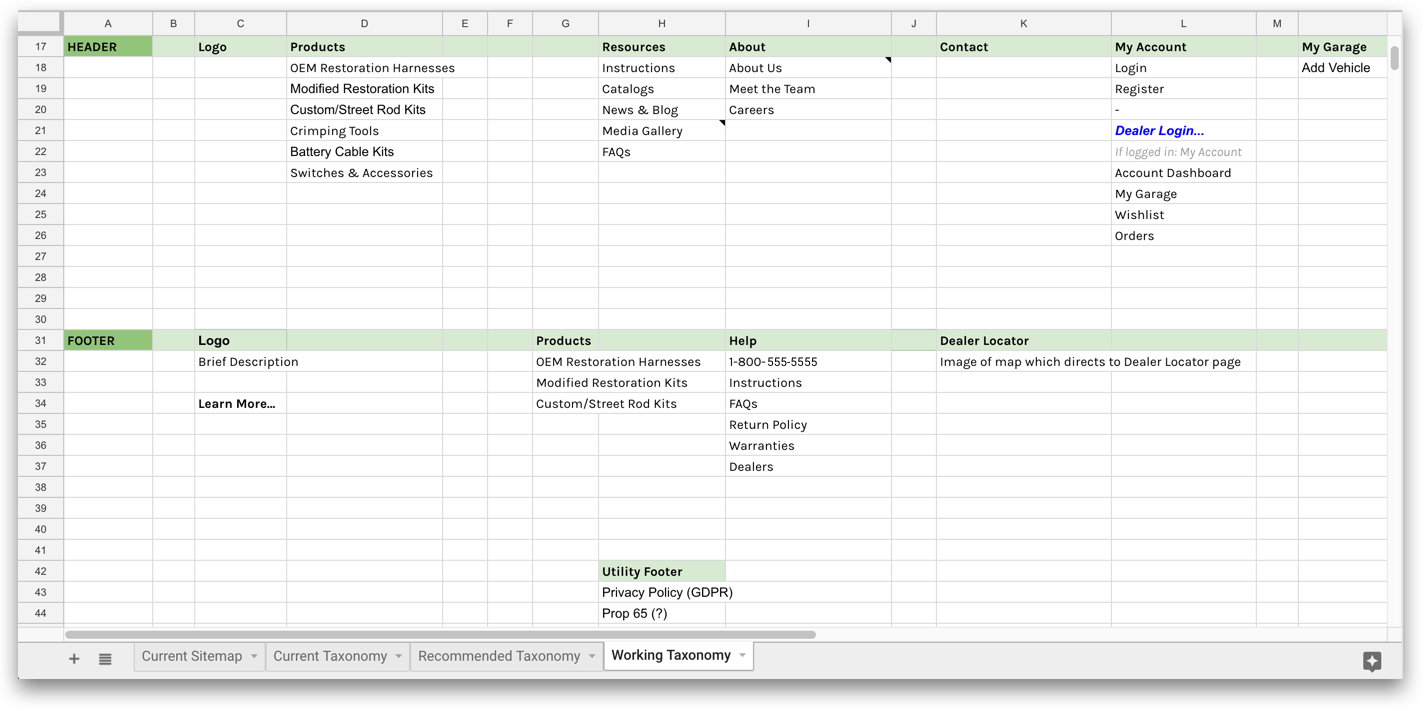
Right away, we discovered inconsistencies in taxonomy which left users baffled and led to page exits. For example, some top-level categories were broken down by manufacturer, some by product type, and others by automobile fit.
Looking at the analytics, we discovered users preferred sorting by product type. Using this data, we established a sitemap which unified the taxonomy by product type and eliminated confusion in the user flow. We also used analytics to discover the most sought resource pages and sorted those accordingly.

Ideation
To help users sort through the 7000 products on the site, we decided early on that Step 1 of the user flow should be to apply a vehicle filter. This would immediately slim down the massive assortment users would have to wade through to find their desired products.
Novice users who were just getting into auto restoration were having a difficult time understanding industry standard terms like "OEM", "Modified", and "Custom/Street Rod" so for Step 2 we created a product wizard to help them learn and discover the products they needed for their project.
During our iterating for the product wizard, we discovered a flaw in our understanding of the term "Custom/Street Rod". Turns out that custom/street rod products can be used universally on any automobile and do not need a vehicle filter applied!
So in our product wizard, we removed the need for a vehicle filter when users want to do any customization.


UX Wireframes
Created over 40 pages of wireframes using in-house template and symbols library. Client required multiple custom pages and page elements for B2B and B2C use cases. Included several rounds of client feedback and weekly stakeholder meetings. High-fidelity wires included developer handoff and interaction notes which were approved by developers before moving onto UI phase.
Client noted in the intitial briefing that they wanted to highlight their dealer portal on the homepage as a broader push to advertise to potential dealers and help existing dealers migrate to online ordering.
After Steps 1 and 2 (vehicle filter and project type) in the user flow, we wired multiple marketing spots on the homepage to showcase this and introduce their business to new users (80% of users were new).


UI Production Mockups
Worked closely with remote design team iterating through multiple prototypes with client feedback. Provided design specs and design direction to incorporate both modern and vintage styles. Wires include developer handoff and interaction notes.
Client recognized branding was outdated but wished to leave it as product packaging maintained this branding.
Design specs outlined primary and secondary colors, typography, interactions, images, and aesthetic inspiration.